honestlyreal

Icon

Broken journey

I’ve seen an awful lot of online government, of one form or another. Consultations, information, tools, maps, communities…and transactions. Transactions really are the very bugger to get right, aren’t they? You wouldn’t think it was that hard to do the basic capture and interchange of information, would you? That there could be so many places to trip up: from daft processes, to forms-turned-into-websites, to mismatched authentication in relation to actual risk, to dreadful, dreadful interaction design.

But there are. And today’s was a gem. Not so much for what it showed about the actual online transaction (which had its issues). But for staggering failures of design around that little thing called a “customer journey”.

It may be a bit of jargon, but the “journey” concept is important. And it’s not just the bit from “land on the right webpage” to “transaction completed”. It’s way broader than that. Or it should be. From the first awareness that something has to be done (or even including general awareness before that point) right the way through the transaction, and on beyond the point of confirmation and into the territory of follow-up action and support. The whole thing. Across all the channels that might play a part (de-jargoning: channels are the types of communication that people can use: typically web, post, telephone, face-to-face and through an intermediary).

So let’s look at how badly this one failed.

A form landed through the post a couple of weeks ago. I need to update the photo on my driving licence. Fair enough. What’s in my wallet has diverged from reality a fair bit in nearly ten years (and I used a five-year-old passport pic even back then).

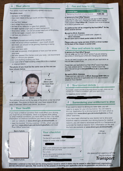
The form was interesting: I had a couple of options to update the photo. In person in a post office (where they’d even be able to take my picture for me), or by post. There was a covering letter on the form that even went to the trouble of telling me where my two nearest post offices were that could do the photo service bit. Nice, I thought. Very nice. A personalised touch on a standard form. Liking this.

But I griped when I read more closely. The photo replacement would cost £20. Fair enough, I supposed there’s some admin involved, and £2 a year doesn’t seem outrageous (though I guess a fair few people would find £20 hard to find out of the blue). And that photo service at the post office? Well, that would cost something too. But it was just left as “An additional fee…”–weird, I thought. Why not just print the amount? Was it £5, or £50? How was I supposed to make a sensible decision about posting or post-officing without knowing the facts? The £20 fee was printed: how very strange just to leave the other one to be a surprise when arriving at the counter?

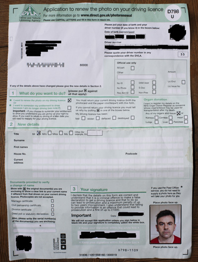
Another little glitch: the form (see pictures) suggests you go online, or pick up the phone, to find out the nearest branch offering the service, yet the covering letter that’s physically attached to the form tells you the two nearest, as I said. Little discontinuities like that are part of the customer journey. They’re causing me to read again, to look between the two documents at the discrepancy, to wonder if I’ve misread something. To make a phone call–a contact that could otherwise be avoided. Details, details, all very important.

The pictures are scruffy because the form stayed in my bag for two weeks, as I never quite found time during the day to go into a post office (and I was still unsighted on how much I’d actually have to pay). As I take photos, I decided today to just shoot one to the required spec and get the damn thing done.

It’s a simple form. It asks for a few bits of information, as well as the photo (which it says must be taken within the last month). Or does it? Please put your date of birth and driver number “if you know it” in the boxes below. (Don’t I just HATE that “if you know it”–it’s a little clue to a bit of poor design…)

Let’s think again about the journey. The way the form has to be used within a wider context. In other words: this form has to be sent back (according to section 1) either with both driving licence parts, or with a declaration that you don’t have them any more. In the first case, they’ve got your date of birth and driver number plastered all over them, so why ask for them again? In the second case, you’re not that likely to know your driver number, are you? And we’re absolutely certain that submission of date of birth is critical here for “security” purposes, or whatever? Really? So those information requests may as well disappear from the form, no?

And before leaping to the conclusion that they must be there as a failsafe in case the envelope’s contents are broken up and dispersed, remember that the form is preprinted with my name and address. Not that tricky to match up with all the stray pink cards lying around on the floor in the post-room in Swansea, now is it?

A couple more check-boxes, a section on organ donation, stick on the photo, and off we go.

Hang on–that organ donation bit: is that section compulsory? It doesn’t say. I can choose between giving my entire usable remains or a selection of organs. Will the form be rejected if I leave them all blank? Stuff like this will cause some forms to be thrust to one side rather than be further completed, perhaps permanently. Never, ever, leave room for doubt.

On the back there’s a whole load of A-F guidance notes. Nothing to fill in. Well, if you actually stop to read (how many will?) B is a quite important section on declaration of health conditions. But nothing to fill in, so I guess it just gets left. Somebody’s box has no doubt been ticked in Swansea. So that’s ok then. There’s some nudging towards Directgov to get further info (oh look, the journey now has an online component–that’s nice).

And so I think: I just spent a while doing a form to send a photo (which doesn’t have to be countersigned–I guess they have a visual inspection in Swansea to check I haven’t suddenly changed race, sex or grown horns) to an agency who are expecting it, and who know full well who I am. Why the hell isn’t this online? And I moaned and tweeted a bit. As I do.

And the shocking answer came back that there was an online service available. At Directgov. Oh, the irony: I worked there for a couple of years and thought I knew most of the available transactions in some detail.

This is the real journey failure. That the form has been sent through my door with no mention whatsoever of the online service. Wait, look back at the very top: that Directgov URL (no, I hadn’t seen it until this point). That starts me off towards an online transaction, though for some inexplicable reason it’s been coded as “For more information…”. Admittedly, it’s the usual “before you apply…” rigmarole (we have to just suck this up, apparently…) but it’s there!

Ah, wait, the handy …/photorenewal URL actually takes me to a whole bunch of other driving licence services (most of which have sod all to do with photo renewal) rather than this one which looks more like it. And yes, even here, I have to do another click to actually get me to the transaction. Because there’s some other information on the page: oh look–there’s the mystery post office service charge–£4.50. Why hide it away there?! And loads of stuff about how to go to a post office and do it…hang on, are we trying to promote the online channel or what? This is getting very confusing. I can now see I’d need a form D798 if I did. But MY form (check those pics) is a D798 U. Now that might be the same form. But it’s another bit of uncertainty. Details, details, again. Another reason to shove it in a drawer, or a bin.

Let me spell this out. Money has been spent creating an online service that (in theory at least) will save the public time, and the taxpayer money. And the people who send out the forms (which is how you know about the service) don’t even mention that it exists as an option. Has anybody actually tested this as a journey? (It was at this point of realisation that I went, as they say, a bit ape.)

And then, the coup de grâce. I hit that “Apply Online” button. It tells me the prerequisites. I need a passport issued within the last five years. Ah, I get it now. If they can verify who I am (they ask for previous addresses, and presumably run an Experian or similar check; in combination with a presented passport number that will probably suffice) they will drag my passport photo between systems and bingo, my driving licence will have a new photo. Presumably there is relatively little risk doing it like this: it’s not as if I can slip an entirely bogus photo into the systems this way–which seems like the main fraud risk within this whole process. (I have skipped over the “role” of the Government Gateway for brevity. More on that can be found here. Though it does at least appear to offer me access to a DVLA dashboard of my information, including my old photo! Which is quite cool. Though what would happen if I connected a second Gateway relationship to my DVLA info is anybody’s guess…)

That’s a “new” photo as in “up to five years old” of course–or possibly even older…is it just me? Is this all sounding both wonderfully joined-up and strangely discontinuous all at the same time? The photo has to be no older than a month by post or post office, but up to five years is ok if you do it online. Riiiiight.

Sadly my passport is a fraction over five years old, so it’s game over online, for me anyway. And why can’t I just email them the damn photo or upload it on a website? There’s nothing on that paper form that I’d be unhappy putting in an email, or a web form. And the picture wouldn’t need rescanning. And I could just certify that I’d destroyed the old licences (the paper process doesn’t fall apart if I mark that as having happened on the form anyway, now does it?)…I could go on, but I won’t. This post is way too long already.

This is an absolute, prime, simple, transactional government-to-citizen interaction. It is the sort of thing that could be reformed NOW. Without an elaborate authentication framework. Without a new website. Without changing more than a few fields and lines on paper and web (or at most, adding a simple image upload process if we really wanted to gold-plate things). The fact that we don’t, or can’t, change it is lamentable. There are no excuses. Really, there aren’t.

POSTSCRIPT

You’ll see in the comments below that I proudly maintained that my application would stay in its envelope, completed and unposted, until such time as I saw fit to, or was compelled to, submit it.

That smug stance was all well and good until I found myself at the Hire Car counter in Venice airport a couple of weeks ago. With an expired driving licence. No car for me. Game over.

While driving licence expiry doesn’t mean much in day-to-day life, when you need to hire a car, it suddenly acquires a new and terrible significance.

I could swear that on the breeze over the lagoon, I could hear a distant voice whispering to me all the way from Swansea:

“Who’s the c*** now, boyo?”
How the Government Gateway works

Caveat: this is not a technical description of how the Gateway works. Nor does it cover the behind-the-scenes services that the Gateway provides in terms of messaging and interoperation between various government systems. But it is my description of the way it works at the front end–the signing-on bit–of government services. Because that’s where it’s most apparent, and that’s the bit that’s often misunderstood. I wrote this because I haven’t been able to find such a description anywhere else on the Internet. Which is slightly odd (isn’t it?) given that the Gateway has been around for about ten years.

For a service that plays a part in millions of online public service transactions a year, the Government Gateway is surprisingly poorly understood, and described. What you can find online varies from the noble attempt (but not exactly functionally descriptive) to the flamboyant, to the technical, and on to the slightly bizarre.

But nothing in plain language that really sets out what’s going on. And, perhaps, what isn’t. I have something of a fascination around the mechanics of authorisation and authentication, particularly when applied to government services, so here goes.

You want to a use a service that has the gateway sign-on apparatus at its front-end. Like Income Tax Self-Assessment. So you go to HMRC’s Self-Assessment service and register as a new, Individual, user (as opposed to an Organisation, Agent or Pensions administrator). Very quickly you’re taken through a brief request for your name and a password, a few warnings about the seriousness of what you’re about to do and the type of documentation you’ll need with you later on, and behold: a big long formal 12-digit User ID pops up. 848355815693 is the one I just registered.

Shriek! Did I just put my Gateway User ID out there on the Internet? Why, yes I did. (We’ll come back to why that doesn’t matter in a moment.) HMRC are now asking me to continue through the process and ‘enrol’ in the service. But we’ll pause there for the moment.

The Government Gateway uses an approach called “Registration and Enrolment” (R&E). First you have to register for a User ID (we just did that). Then you have to enrol in the various services you want to use with it. Enrolment means you go through a process, specific to the service you’re trying to use, of giving proof of who you are and that you’re entitled to use the service. Leaving it up to the service to decide how much proof is needed is a really good thing, surely? No avalanche of information required to use a simple, low-value, low-risk service? We’ll see…

In theory, therefore, you can add more and more services to your ID, leading to what becomes a single sign-on for lots of services, using the same User ID and password. In theory.

The great genius of the Gateway R&E design is that it does the reverse of what you’d expect. Instead of trying to be all secure up front–insisting you prove entitlement and identity straight away–it wilfully ignores all that and gives you a wholly anonymous, “throwaway” ID number. You can go and get as many as you like. Try it yourself, now. Really, go and do it a few times. You can either do it via hmrc.gov.uk (just my little joke) or at the Gateway’s own site. They both work the same way.

It was once memorably described by a much cleverer colleague as “an insecure keyring to which you can attach secure keys”. (Great, until you need to find your keyring.)

The great folly of R&E is that it is utterly pointless, unsupportable, and ultimately valueless for normal people in real life. Have you spotted the gaping holes yet? Before we expose them in more detail, let’s quickly look at enrolment.

For HMRC self-assessment the enrolment process is the bit where you enter your Tax Reference Number and a few other bits of identifying information. And then you wait. For a PIN to arrive in the post. As a means of confirming you are who you say you are, before you can go any further. Not quite a seamless electronic transaction there, then. In the days leading up to Jan 31st the post seems to move very slowly indeed. And you might lose that 12-digit number in the meantime.

DVLA have a twist on the process: not for them the “give us a name and here’s your ID” approach. Oh no. They ask for lots of other qualifying information, name, address, Date of Birth, Passport Number, and—of course—money before they get to the bit where they spit out your new provisional driving licence. Not bad, really.

They’ve almost masked the presence of the Gateway entirely. There’s a question at the very beginning saying: “While applying, you’ll be issued with a Government Gateway user ID. If you already have a Government Gateway User ID, simply enter it with your password.” And if you haven’t, can’t remember it, or can’t be bothered—don’t fret, you can just get another one.

Getting a sinking feeling about the value of this User ID yet? (And actually, people will fret. They will spot this sort of “do I/don’t I need to…” ambiguity and it will delay or put off some people from using the service.) Doubt is something you really want to design out of online transactions.

So, behind the scenes, DVLA just went and generated you another Gateway User ID. One you’ll probably never need again, and one which carries no security risk, but isn’t necessarily anything to do with your other Gateway relationships. Unless you happened to have a previous one to hand when you applied. (I’d love to see some stats on how many do this, by the way.)

So, let’s look at what’s really bad about all this (and I stress again that I am talking about the user experience of the Gateway as a front end to transactions: Gateway R&E. Not about the back-end messaging standards which also form part of the Gateway suite of services):

1. Unsupportable. You can’t find your Gateway ID or password: what do you do? No point approaching the Government Gateway team—they don’t know who you are. They only recorded a name and password (which you might have lost). If you’re going to start resetting passwords and handing out IDs by email you need some better checks than that. They don’t have any information to check against. (And you’ve probably spawned several by now as you’ve been navigating through various online services. Which one have you lost?) So you approach HMRC, or whoever you need to deal with at the time. And they ask for your Tax Reference Number. Because your relationship is with them and that’s how they know you. The Gateway adds no value.

2. Take-up. Despite a bit of official posturing about it being government’s preferred online transaction authentication solution, and a few high-profile services which incorporate the front-end bit in some inconsistent way, most services routinely ignore it. Look at this service list: and this service has been operating for how many years, and has had how much spent on it? The Gateway is routinely ignored at the front end because it adds no value.

3. Lack of transparency or challenge. Try and find another piece like this on the internet that explains what’s going on and casts a critical eye over value. People seem remarkably reticent to discuss something that is a pretty big feature on the government technology landscape. If they do praise it, it looks like this, emphasising the benefits to service providers of using its protocols and messaging, but glossing over the broken stuff with phrases like “allows citizens to have one user ID and password”. Yes. In theory. Oh pur-lease.

4. It’s not Your Account for Government. It never can be. It’s designed not to be. This is a particularly pernicious failing. It raises expectations that it should, somehow, be a single connection point between citizen and state online. When it’s compromised, we panic. When it fails to add any value, we’re disappointed. We’ve been, effectively, duped into thinking some sort of useful, usable functionality has been added. It hasn’t.

5. It fundamentally misreads individual user behaviour online. People do share and lose their IDs and passwords. Putting in a wait for the postman does result in everything having to be redone, and in sapping user confidence in government’s online services. The situation is slightly better for businesses, and I will concede that for business-facing transactions (and for accountants, agents and other intermediaries), Gateway R&E probably does add some value. But there’s a hell of a difference between employing someone whose job it is to get these processes right, and providing services to individuals.

One can see why Gateway R&E had some attractions: ten years ago, when it started, there was massive political pressure to bring public services online. Earlier attempts to build a secure authentication framework across all services had foundered (and still do, see numerous other posts here on this). This half-way house created a way in which the press and public could be fed stuff like that BCS line above, and we public could be left to pick up the pieces of a miserable, broken, user experience.

A value-adding single sign-on experience can be yours. If only you don’t do stupid stuff like lose passwords, IDs, or a strange little card we send you, and if you can manage to navigate around the workarounds (like that DVLA “if you already have…” stuff) that we have to build into every service to make them actually get used.

Time for a few pointed questions and FOIs, I think. Because this is fundamentally difficult territory, I think it’s had a bit of an easy ride.

The Weakest Link

(Yes, that is me on the left…)

Imagine you have some diamonds. Small, valuable and very, very desirable. You don’t want them to get nicked, so you lock them in a safe with a bloody massive key. Made of splendonium and other magical unbreakable materials. And then you take your splendonium key and you put THAT in ANOTHER safe, just to be sure. And you lock the second safe using the cheapest Yale lock you can find. In a fitting so loose that you don’t even need a credit card to slide the mechanism across. You could probably do it with a beer mat.

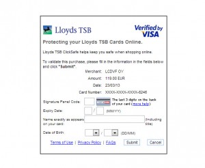
A security system is, rather obviously, only as strong as its weakest component. I am reminded of that wretched Verified by Visa thing where it looks rather like there’s a nice splendonium key that you have to use to confirm your transaction, but if you forget it, you only actually need to know your (or your victim’s) date of birth to generate a new one. So why not just ask for the sodding date of birth outright then and spare us all the pretence? (We know it’s some rubbish to do with perceived liability, but that’s not the point of this post.)

———

UPDATE 23 March 2013

It seems there have been some changes: a new version just popped up, asking me to repeat three fields of information I’d just given the vendor, and asking me to add date of birth. No more of that ridiculous, and often one-use, password. Somebody obviously thought a bit harder about the information flow. But it’s still a heap of shit.

Verified by Visa

———

So, back to the point. If there’s a short-cut through a system, making the best use of known information, why does the following STILL happen as a matter of course:

  • I go to a website I visit very infrequently, say to buy some teabags.*
  • It asks me to enter my email address. So far so good.
  • It asks me for my password. Uh-oh. Not a clue.
  • I click on the button marked “Forgotten password?”
  • I enter my email address again on the next screen and click SEND.
  • I go to my inbox and find the email.
  • Best case, I can see the password there. Actually, it’s not that great a case, as I might just, carelessly, have used it elsewhere, and now it’s being sent over the Internet in clear. Hmm.
  • Worst case, I get a link to trigger a password reset process, involving me going back to the site and picking a new one.
  • Finally, I limp back to the site with my old/new password, log in, and try and remember what I was going there for. And I have to go through all this–with many password resets–every time I visit.

Not that great, really. And what was really going on, in logical terms? I was being asked if I had access to the email account I claimed to have. That’s all. The rest was all about their convenience–making me think I had some sort of special, sticky “membership” relationship with them–not mine. I just wanted teabags; not to be a sticky member.

So why not just design in that route–or a vastly simplified version of it–from the start?

Try this:

  • I go to a website I visit very infrequently, say to buy some teabags.
  • It asks me to enter my email address. So far so good.
  • It offers me a choice–two options: “enter your password” (if you can remember it) OR “log-in via email”.
  • Being no great fan of having a password for a site I barely use, I click the latter option.
  • I go to my inbox and find the email.
  • It’s only got one thing in it. A big fat link that I click to get straight back to the site, logged in, with all my previous purchases winking at me for a repeat order. No password change. No bother.

Am I missing something? Why doesn’t this happen everywhere, as a matter of course?

*Probably only William Heath who’ll spot the in-joke there…

The unstructured conversation

The old service dilemma: do a good job or do a cheap job. We often try to pretend that both are achievable. But they’re not.

Ask a group of consumers what service they’d like, and–without giving a hoot about cost–the inevitable answers come: “make it more about me”–“talk to me like a human being”. And, crucially, “take on my problems as if they were your own, and come back to me when they’re sorted”.

The closer one gets as a service provider to offering this latter state of bliss, the less structured the interaction becomes. If I make you fill in some really complex forms, and offer very limited ways of capturing your information, it’s a pretty good sign that I’ve thought a bit more about me (and my costs), and less about you.

Here’s a couple of little giveaways:

  • postcodes. Put in SW1A0AA, or sw1 A0aa, and watch things fall over. Why? Coz you have to put in a space (computer says ‘no’)… Well, of course you don’t really, it’s just the system we put in was a bit cheaper and didn’t allow for all the possible combinations of upper/lower case, with/without spaces, so you just structure it the way we ask you to. It’s not about you, after all…
  • credit card numbers. Four blocks of numbers, separated by spaces? Oh. No you don’t. Coz you realise after tapping most of your number in that you’ve hit some kind of wall. We didn’t build it to allow spaces, coz, erm, we just didn’t. Start again. We like things structured here. Our way.

If your service providers and suppliers haven’t thought the little things through, what makes you think they’re going to be great on the big stuff? And you can tell all this just from the application forms…

The unstructured conversation is the one we’re all asking for: freeform depositing of issues, returning later (as to the laundrette) to pick up the cleaned and ironed outputs. The “service wash” of consumer service, if you like. You really can’t be that surprised that it’s going to cost more, can you? And because of that, you’re not going to see so much of it. But treasure it when you do, and let the people know…