It has to be one of the most ambitious, and successful, mass portrait photography projects of all time. You see them everywhere – the portraits of MPs and Lords, produced by a Parliament team led by Carrie Kleiner, and shot by accomplished portrait photographer Chris McAndrew.
I know a little bit about the workings of Parliament from my previous career, and it’s a place like no other. It’s not government, for one thing. Nor is it “a company”. Instead it’s a collection of members, with some responsibilities to their political parties, answerable to their electors.
When you shoot a set of portraits in the corporate world, you usually have in mind some overarching theme that you want the project to convey. This might be one of “warm engagement”, it could be “quirky mavericks”, “responsibly sombre” or perhaps – as with one of my regular clients – the no-nonsense faces of criminal barristers.
With parliamentarians, though, you don’t just have a vast cast list of wildly differing personalities, you’re also dealing with some who will mainly be thought of as constituency figures, others with ministerial responsibilities, and some who run parties, or even parties-within-parties.
In short it’s as wide and tough a brief as one could imagine. And they’re not employees. They won’t be told what to do. If they don’t want to have their photo taken, they don’t have to.
So I can only imagine the work needed to get this to happen at all, and the team did an amazing job to get as many of them included as they did. Carrie has written some good stuff here about how they approached it. (They did it efficiently too, at a cost of less than £20 per portrait [excluding internal Parliamentary staff time]. There’s a whole other post to be written here about the commercial aspects of a job like this.)
I’ve thought a lot about this project. The issues involved are those of my working world too. These are a few of the thoughts and lessons it’s inspired in me:
Simplicity
If you’ve got a monster portrait project, and little time to do it in, keep it simple. It looks like this was done with a single studio light – up and to the right of the frame, with the subject set against a plain background. There are more interesting compositions, sure, but they’d all take more time, and have many more ways for things to go wrong.
Consistency
This has advantages and disadvantages, and is a useful point to think about if you ever have to commission your own set of company portraits. While the same aesthetic will bring consistency across the set, and helps to brand them as all being part of the same endeavour, individual appearances vary hugely. It’s not always easy to find one aesthetic that will suit every single person. Differences in size, shape, skin pigment, texture… all of these have a bearing on the final result. Some subjects will definitely come out of the process better than others.
Derealisation
What do I mean here? Well, you’ve probably experienced this with your own image. Did you ever look at a black and white version of your face and think – “oh, that’s so much nicer!”? There are a few reasons why this can happen, but one of them is that black and white is a quick way to create a distance from reality. Given the, er, complex relationship most of us have with our own image, having a bit of room to see ourselves abstracted can often help us accept, or even enjoy, the result. With this portrait set, I think there’s been a deliberate choice to ‘cool down’ the images – shifting the colour palette down to the blue end of the spectrum. It’s what makes these pictures look a little ‘blue’ or ‘cold’ overall. It really helps to give them a distinctive look, but it also helps to make them just a little bit unreal – at least in tone.
Authenticity
They are, however, ruthlessly real in other aspects. They are, as far as I can judge, unretouched. We’re in really interesting territory here in terms of what we mean by the ‘truth’ of a portrait. Whether Cromwell actually used the words “warts and all” to his portrait artist Sir Peter Lely, is unknown. But we all recognise the sentiment. The role of the portrait painter was to convey an artistic impression – very possibly a flattering one – of the subject. But the role of the photographer? Well, within the world of PR photography, not all that different. But in the world of journalism? Very. A little adjustment of colour, brightness and contrast, maybe, but no retouching as such.
So are these photos to be seen as PR work, or journalism? In a sense they fall between the two stools. They are not a “news story” (although they did become one) nor are they an exercise in image management. The project team have come down firmly on the side of the journalists – unairbrushed reality. If the subject has a bit of a sweat on, it’s in. A pimple or a wart? Same. A few flakes of dandruff or a stray hair on their collar? You get the picture. It’s really easy to see the sort of problems a project like this might run into if it were seen to have manipulated the photos to flatter. But it shows the weight of the decisions that were involved.
Judgement
While there’s a whole lot of work involved in planning and shooting a picture set like this, once the lights are packed up there’s still more to be done. Carrie’s post talks about 15,000 photos taken – that’s bang on what I would expect – about 25 clicks for each subject. Discounting blinks, grimaces and the odd flash failure or lighting quirk, that leaves with you a few good options that are all technically ‘usable’. And from there you have to make a choice: which is the ‘best’? And having made that choice, to what extent do you seek your subject’s agreement? I’ve got no knowledge of how the process worked in this case, but I know from my own experience that there’s an enormous amount of judgement and negotiation required to get from the end of the shoot to final publication. (And a bit of digging into some of the history recorded in Wikipedia points to the fact that not every subject in this project liked what they got. That’s another inevitability of big portrait projects in the real world.)
Licensing
This might seem a bit of a niche point, but it’s worth some exploration. Normally when you do corporate portraiture, the aim is to make it available for the needs of the organisation (published on a website, for example) and possibly also for use by individual subjects. Here though, the ambition was much wider – to create a collection of photos to be available for use by anyone. The press, the subjects themselves, and indeed Wikipedia. So that means using an ‘open licence’ – allowing others to use the images. The licence they used – a “Creative Commons” licence – requires anyone using the images to credit the copyright holder. Other than Wikipedia, nobody’s done that as far as I’ve seen, which does make a bit of a mockery of the whole concept. Technically, most uses of these images are in breach of the licence and users could theoretically be chased up for money. (Not likely to happen in this case, I think.)
But here’s the nerdy bit which got me thinking – Creative Commons licences come in a variety of different flavours. Some put a “non-commercial” restriction on how images can be used, though what this means is often difficult to define in practice. Others say that “no derivatives” can be made of the image – so no tweaking, or making into collages, or memes, or whatever (though a copyright exception does exist which can help in the latter case). There are other more baroque variants, and you can read your fill here, but it’s notable that Wikipedia requires a pretty simple flavour, with very little restriction on reuse.
(Maybe, given the lack of likelihood of anybody bothering to attribute the images, combined with the lack of interest in enforcing a licence, a CC0 “public domain” designation would have been more appropriate. There’s definitely a good argument for it.)
So let’s take those points about authenticity and licensing and have a bit of fun. Because anyone can take those images and modify them, I can take those images and modify them. (Do I feel entirely comfortable doing this? No. Taking and editing someone else’s work is always weird. Especially when it features a living subject with whom I have no connection. But that’s the nature of this type of licensing and usage, so please forgive me. I should stress that there’s nothing ‘wrong’ with the original images, and I’ve described some of the context and thinking that’s likely to have been involved.)
What if I treated them as I might treat a PR photography shoot? I might undo that decision on colour balance, for instance. And might I then fix a few blemishes, the odd mark on a suit, a stray hair, or perhaps a few pounds around the jowls? You see where this goes, obviously – but where does it end? (In truth, I have pretty strict ethical rules about what I will and won’t do in terms of retouching. Every photographer should. Anything that could be done with better lighting or in a make-up artist’s chair, I’m generally ok with. Reshaping bodies is pretty much always a no-no, other than for a few exceptions such as very closed eyes. I have bent my rules a little in this post, as the images are purely for illustration.)
I sometimes have to work from less than ideal starting images, but still get the job done. As the first example, consider Diane Abbott as she appears in the official set, how I might rework her in a PR edit, and the image she uses for her own Twitter bio.
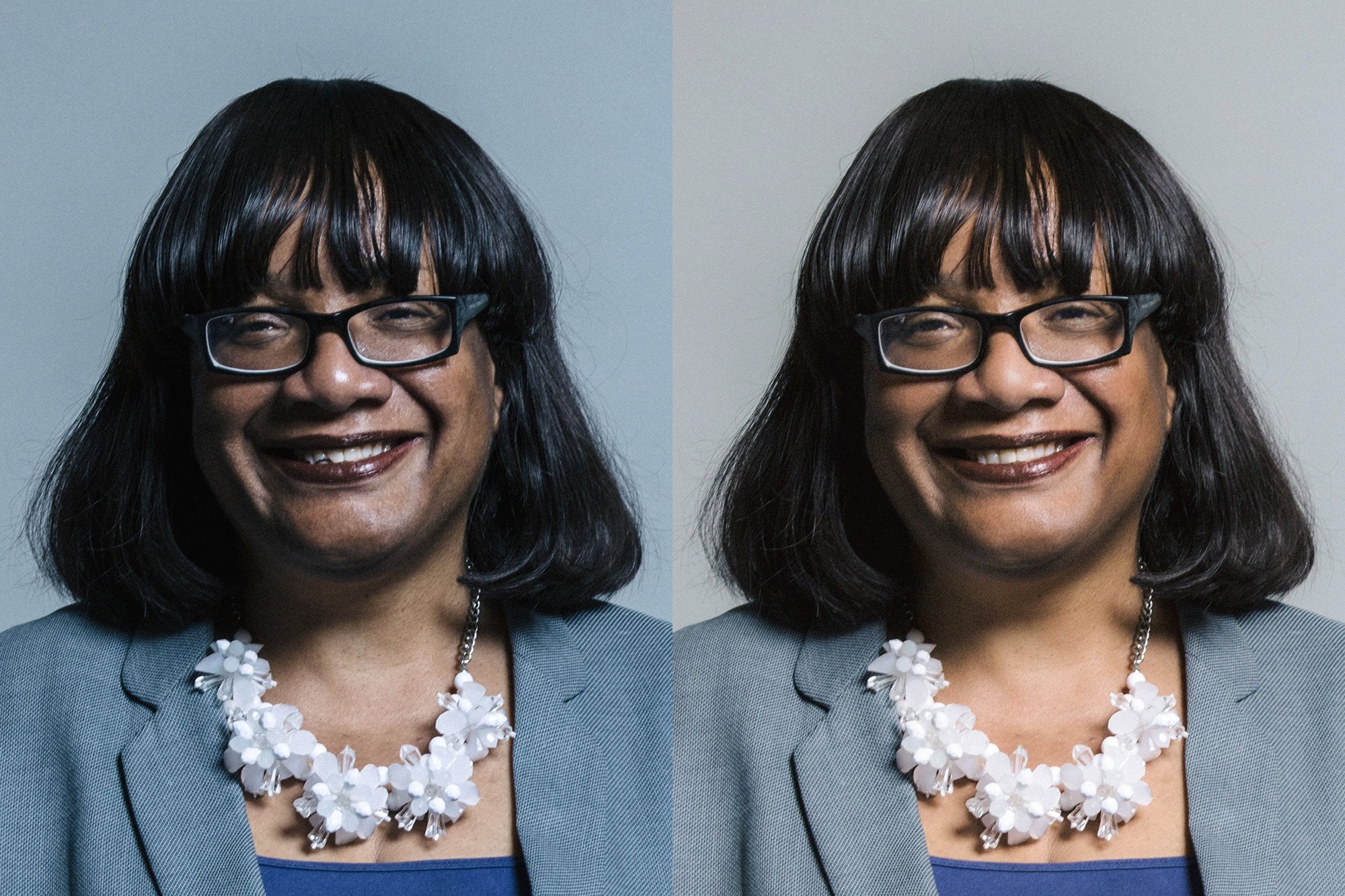
Diane Abbott – UK Parliament official portraits 2017 (L); edited version (R) – see attribution line below
(My versions [right hand side] are attributed as: derivatives (colour adjusted, with cosmetic edits) of original work by Chris McAndrew, made available for download at https://beta.parliament.uk/houses/1AFu55Hs/members/current/a-z/a, and used under CC BY 3.0. They are not made available for reuse; there is no “share-alike” requirement to do so and their reuse would go beyond the objectives of this post. Interestingly two of these photos, Penny Mordaunt and Rory Stewart, are no longer available on the Parliament site but remain within the Wikimedia Commons as their licensing there is irrevocable.)
So enjoy a few more example “PR edits”. I’ve not described in detail the changes I’ve made, to spare any blushes of the subjects, but see if you can spot the differences. I’ve already seen one published example out there of an edited version from this original project, and we may well see more. Keep your eyes open!
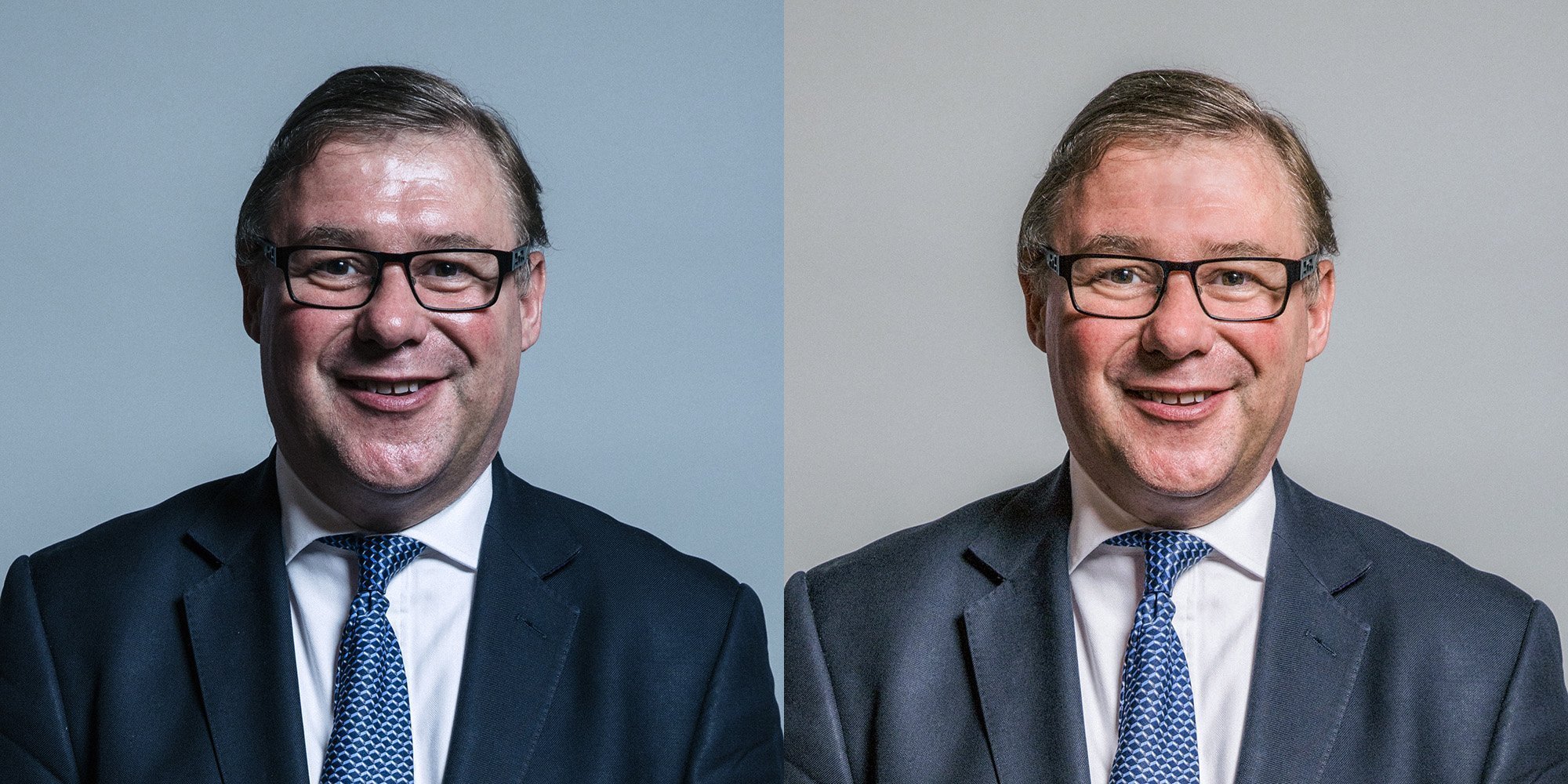
Mark Francois – UK Parliament official portraits 2017 (L); edited version (R) – see attribution line above
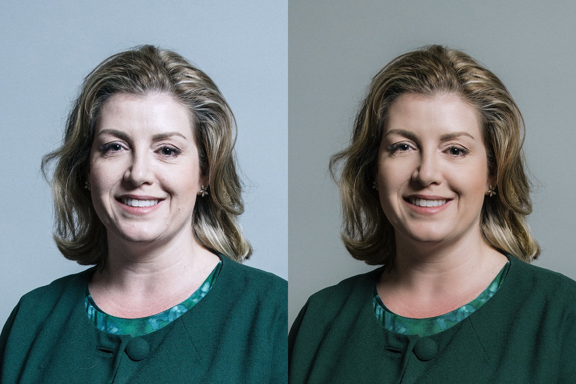
Penelope Mordaunt – UK Parliament official portraits 2017 (L); edited version (R) – see attribution line above
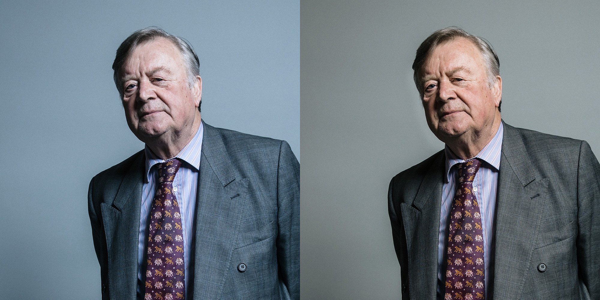
Kenneth Clarke – UK Parliament official portraits 2017 (L); edited version (R) – see attribution line above
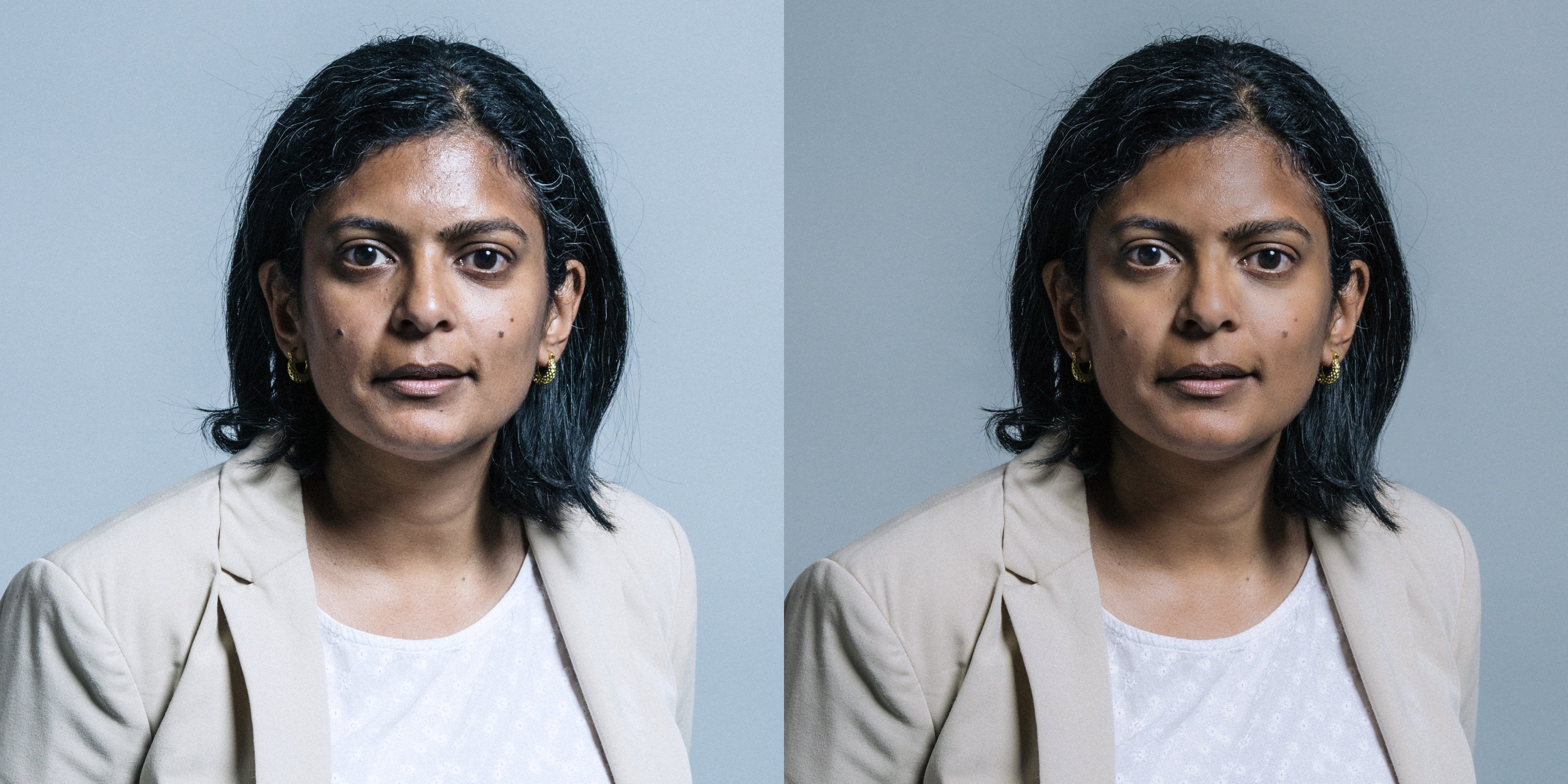
Rupa Huq – UK Parliament official portraits 2017 (L); edited version (R) – see attribution line above
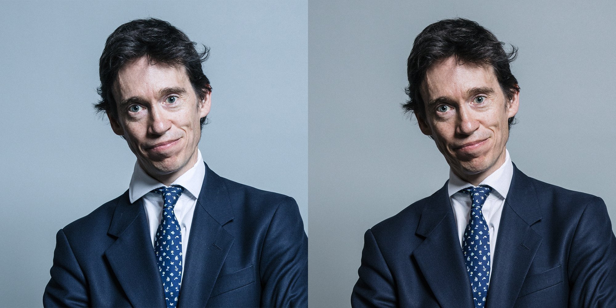
Roderick [Rory] Stewart – UK Parliament official portraits 2017 (L); edited version (R) – see attribution line above
Some great thoughts there, and interesting to see what you’ve done with the images. It can be seen that the backdrops in your revisions have different tones to each other, which does lose the feeling of them being a unified set, especially were they to be displayed adjacent, as is currently done on Wikipedia.
I shall certainly look at my straight-out-of-the-camera portrait shots for Wikipedia in a different, er, light in future.
I set out, back in 2012, why the public should have a right to use an image of not only their representatives, but councillors and other public servants, such as senior police officers:
http://pigsonthewing.org.uk/politician-open-licensed-pictures-please/
You mention that you have seen these images used without attribution, but it’s possible that the parliamentary authorities have dual-licensed them; CC by for you and me, but “feel free to use them without attribution” for the press, etc. This is no different to the image that I have on Wikipedia, under CC by-sa, but have sold to a publisher for their use without attribution.
I’d be surprised if there had been as sophisticated a release strategy as that – I suspect they were just made available through the beta site. I’ll try and find out. Carrie has tweeted the following helpful comment today: “In relation to the licence choice, we chose that one so that we could retain control should we discover people using the images for more … unsavoury purposes. ;)”
On the tonal differences in background – yes, good spot. This is often an issue where the people benefit from individual adjustment, but the background shows it up. This can be addressed by doing either a cut-out and placement on to a standard background for absolute consistency, or doing a selection and adjustment of the background tone to mitigate any extreme differences.
In every case, I much prefer your version. I do think that their decision to shift bluish on everything makes people look colder and much less relatable. I’m not sure that’s a great effect to end up with when you’re talking about the group of people responsible for running the country. The last thing we need is for politicians to look more distant.
Interesting. I was actually thinking about the distancing as being a mechanism to help the pictures be adopted by the subjects, some of whom weren’t at the back of the queue when egos were handed out, but yes, I take your point!